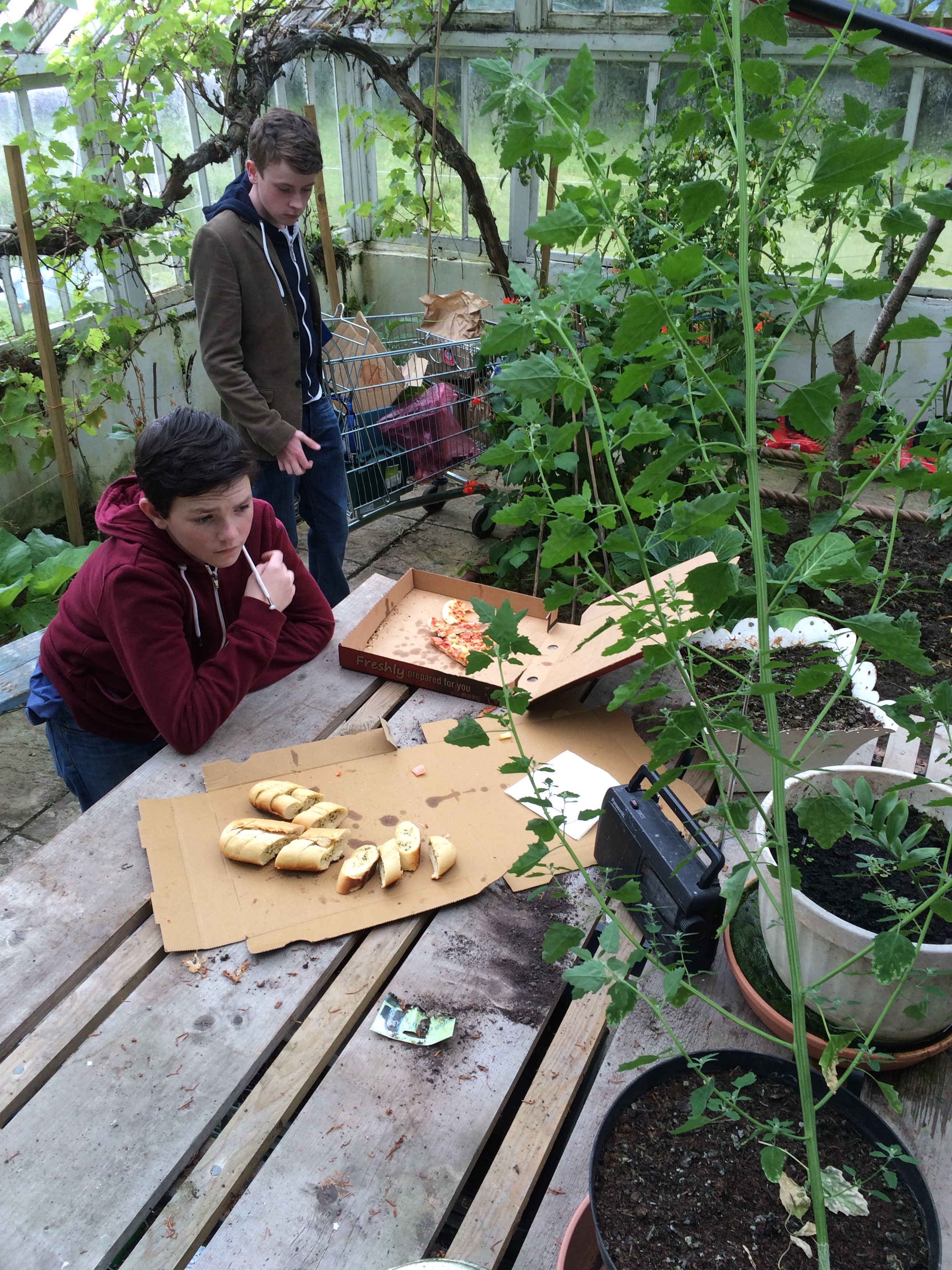
Time and Again – Art Direction
Written and directed by Aidan Largey, produced by Causeway Pictures and What’s Next Films. I was brought in to oversee the art department of this short film a few days before filming. The shoot was across several spaces at one location, requiring sets to be decorated and struck sequentially while filming was in progress. The main challenge here was time. The young actors had a rigid schedule to work to and the design/source pre-production phase was very short.
The film follows a boy genius and his best friend as the salvage parts to create a time machine, while navigating their relationships with each other and their family. It was shot over three days on a small estate near Crossgar, N. Ireland. There were a handful of obstacles to overcome in the set dressing, such as making one outhouse look like a school room and a dining room on opposing sides. That said, for the main garage space it was a matter of layering our own story on what was already there.
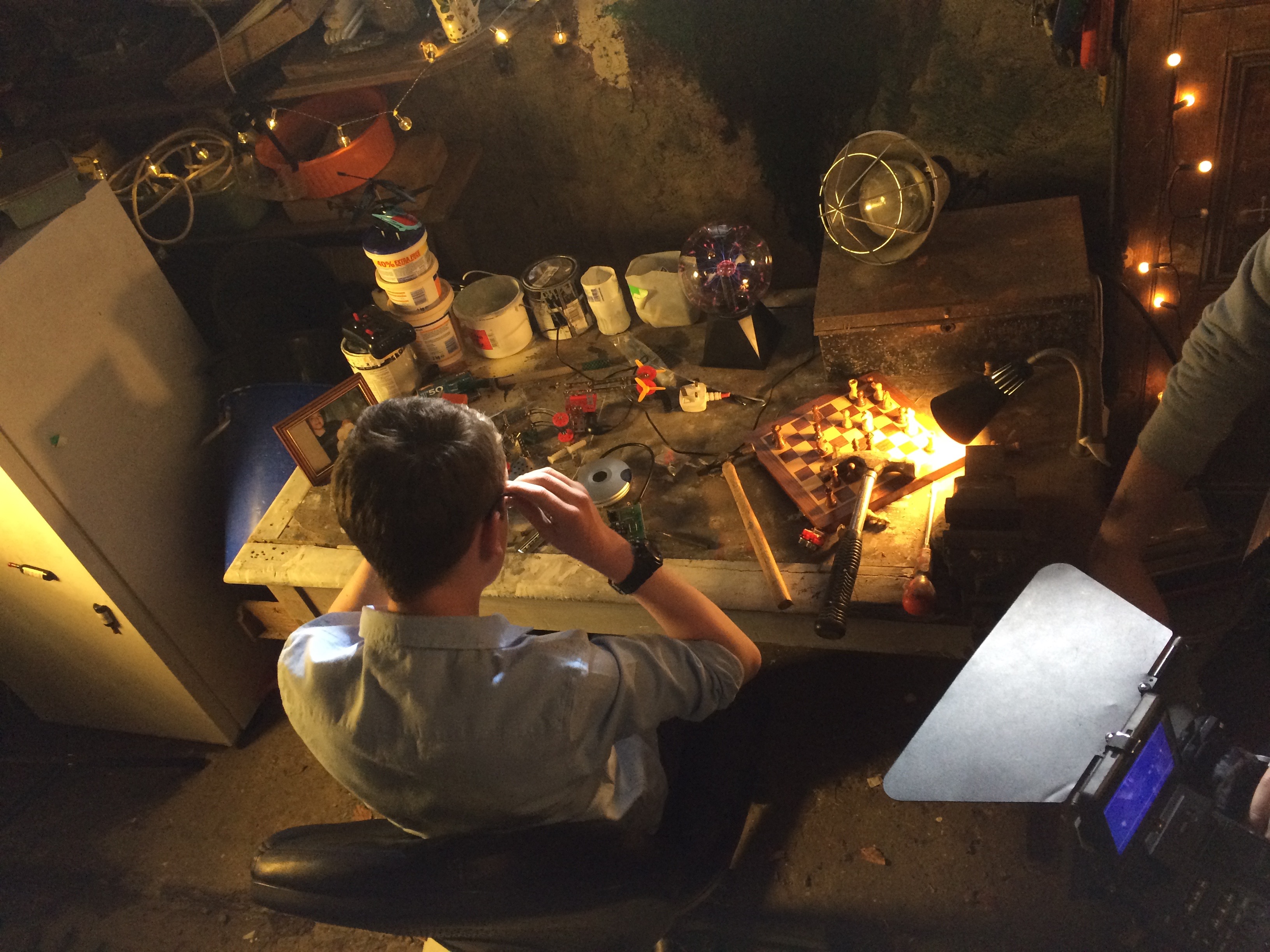
The Garage
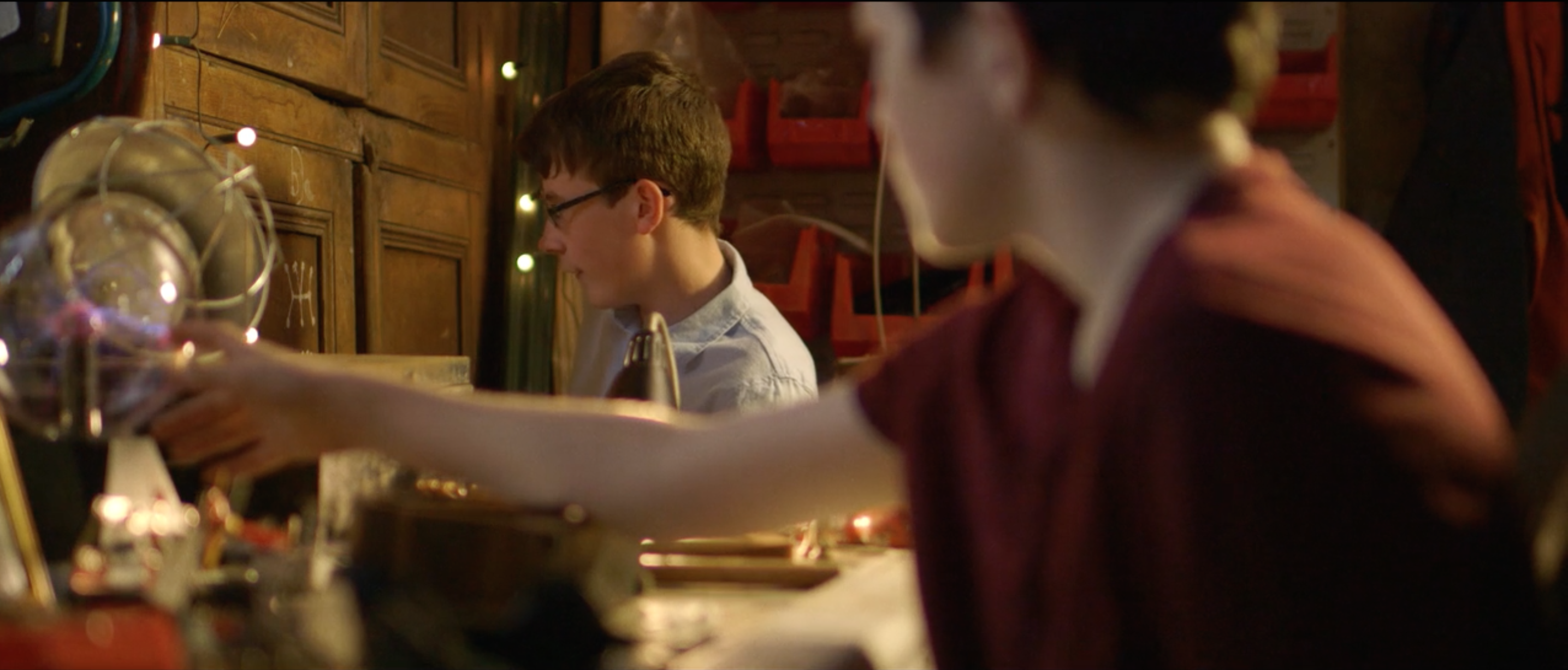
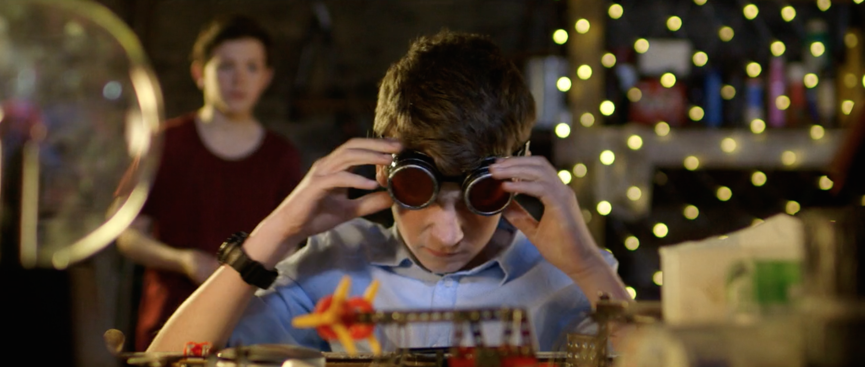
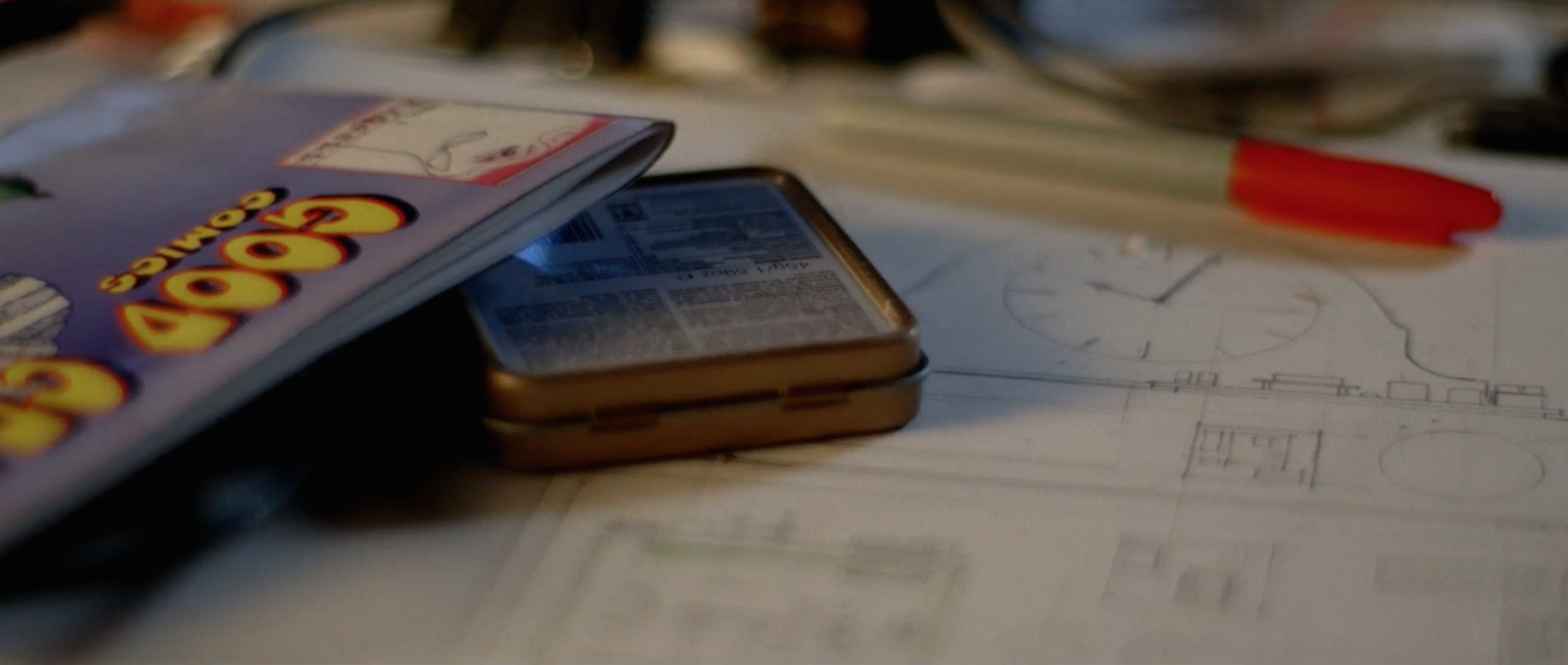
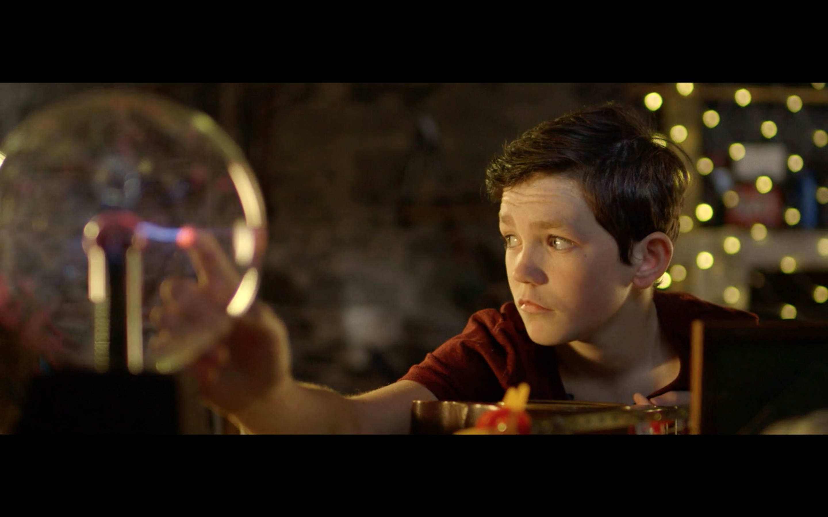
This space needed to look something like a rough workspace inhabited by kids. Elements of both scientific construction and toys littered the room. Custom made schematics, book covers and posters were made for the scene. Fairy lights softened the space and workbench lights added some practical lighting. Various toys were then scattered along the surfaces; the plasma globe ended up becoming a prominent feature.
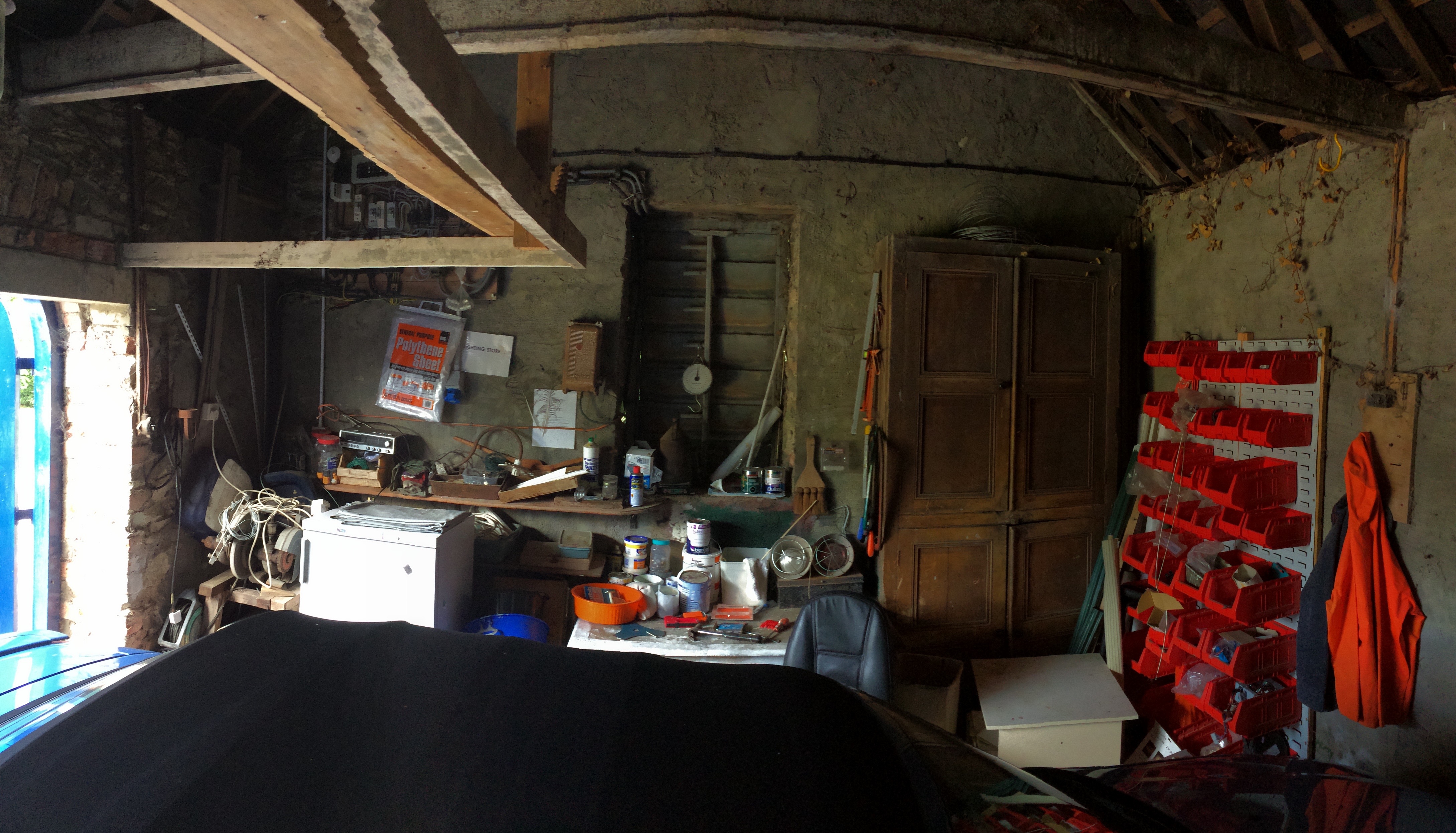
Garage Photo – Before Dressing
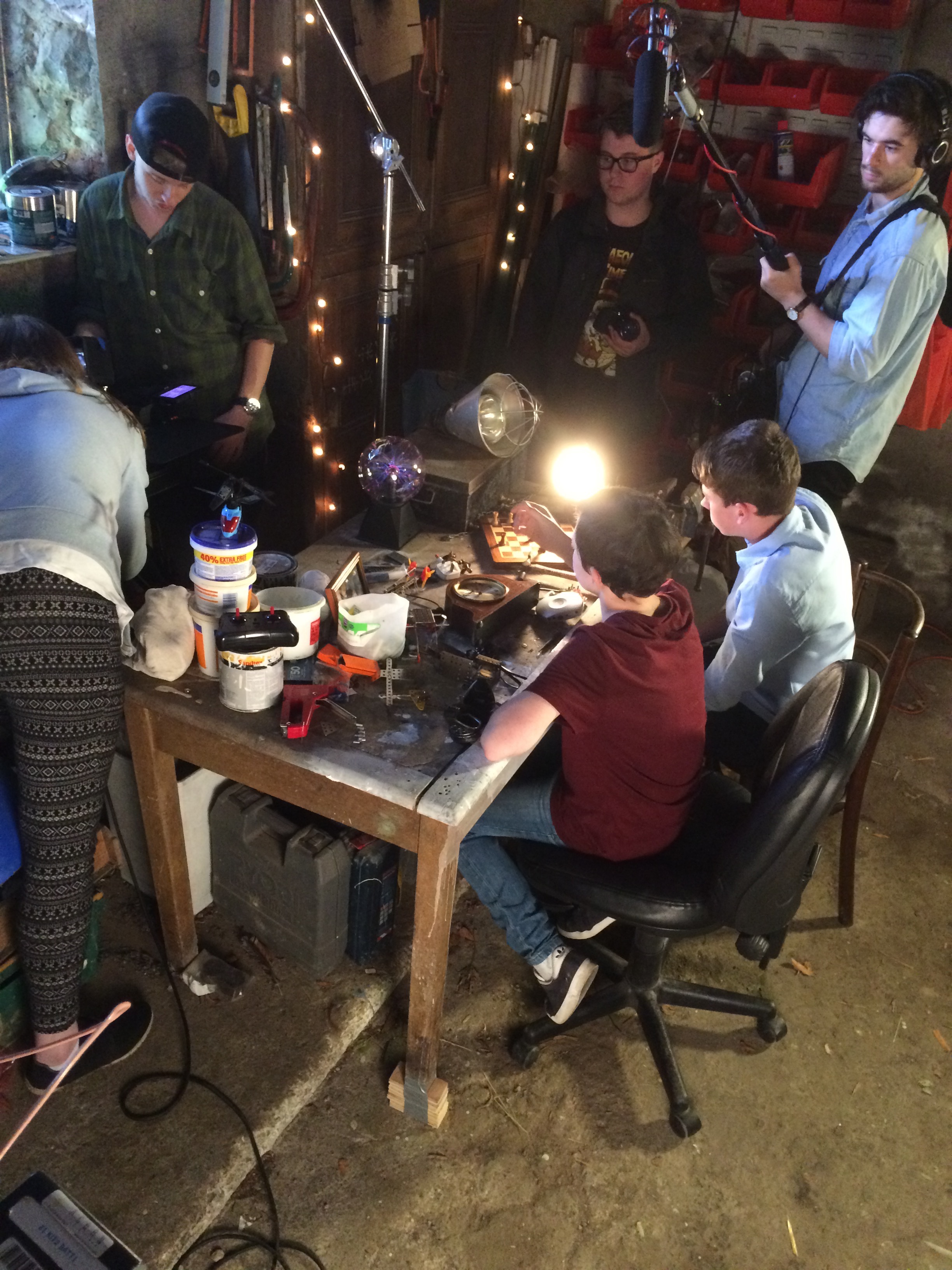
Dining Room / School
This was a single room, to be cleared and decorated for two separate scenes. The obstacle here was hiding the distinct orange/beige bricks for the school scene without damaging the wall surface. I managed to temporarily paper half the room using wallpaper lining and sticky pads. For the dining room the DoP, Aidan Gault, referenced images of strong symmetry. I hunted for furniture and fixtures that I could find in couples to achieve this (bearing in mind the small dressing budget). I then made tablecloths and runners to create contrasting colour scheme to the sickly coloured walls.
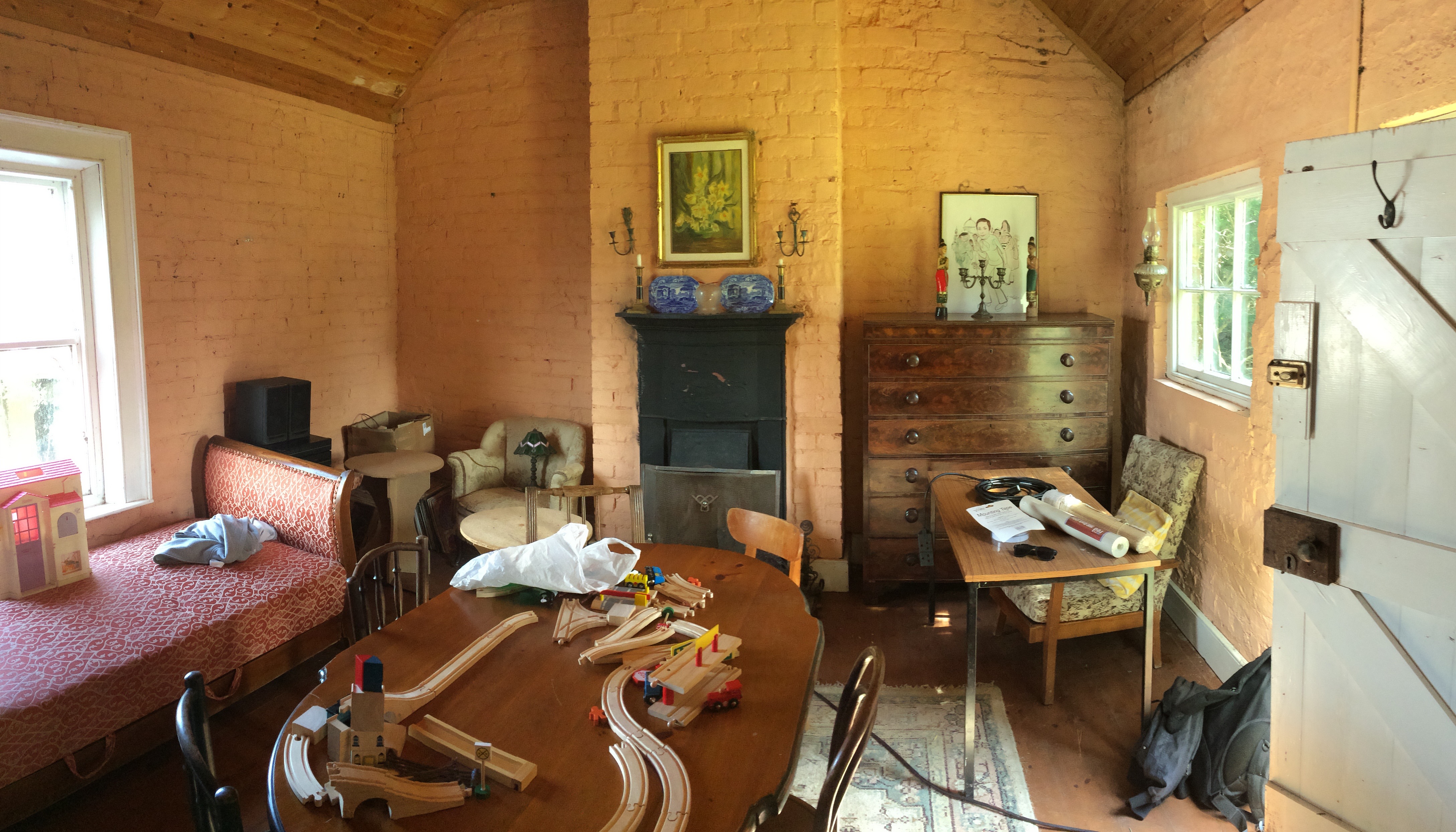
Dining room – Before
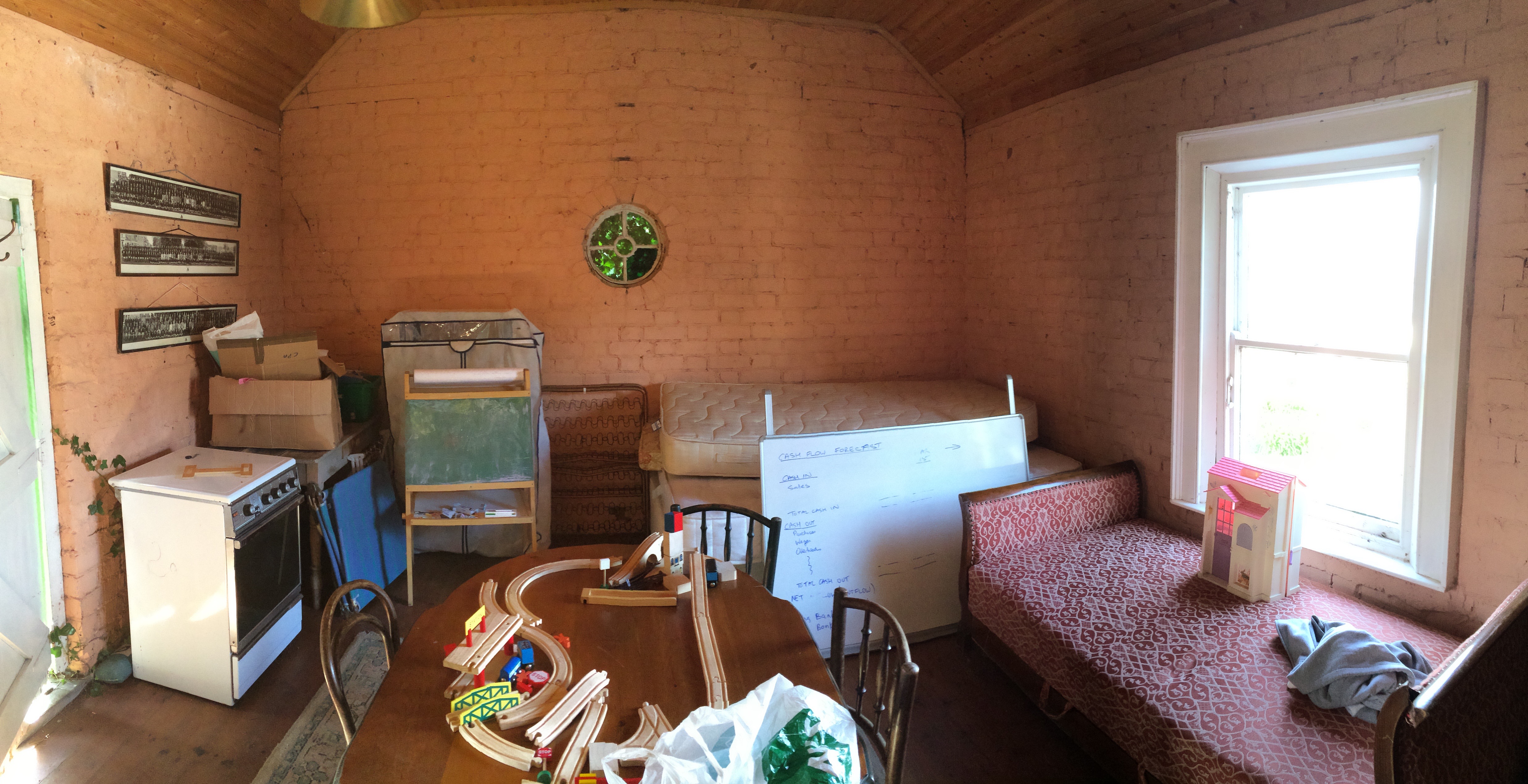
School room – Before
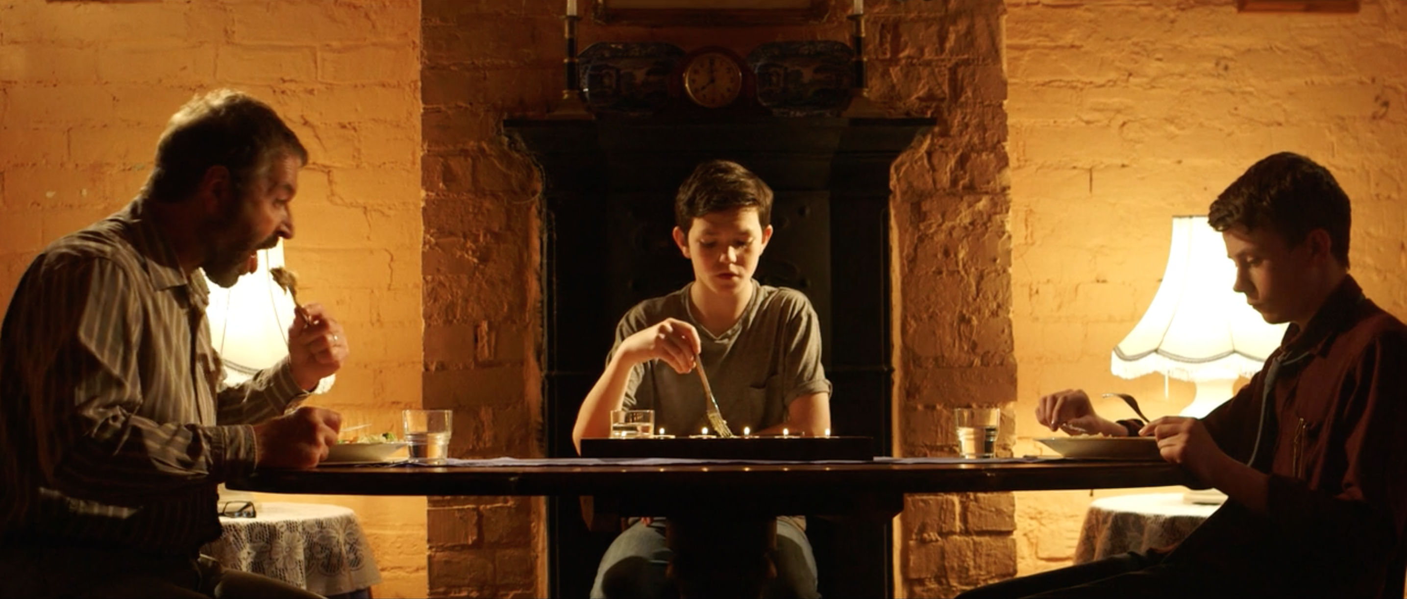
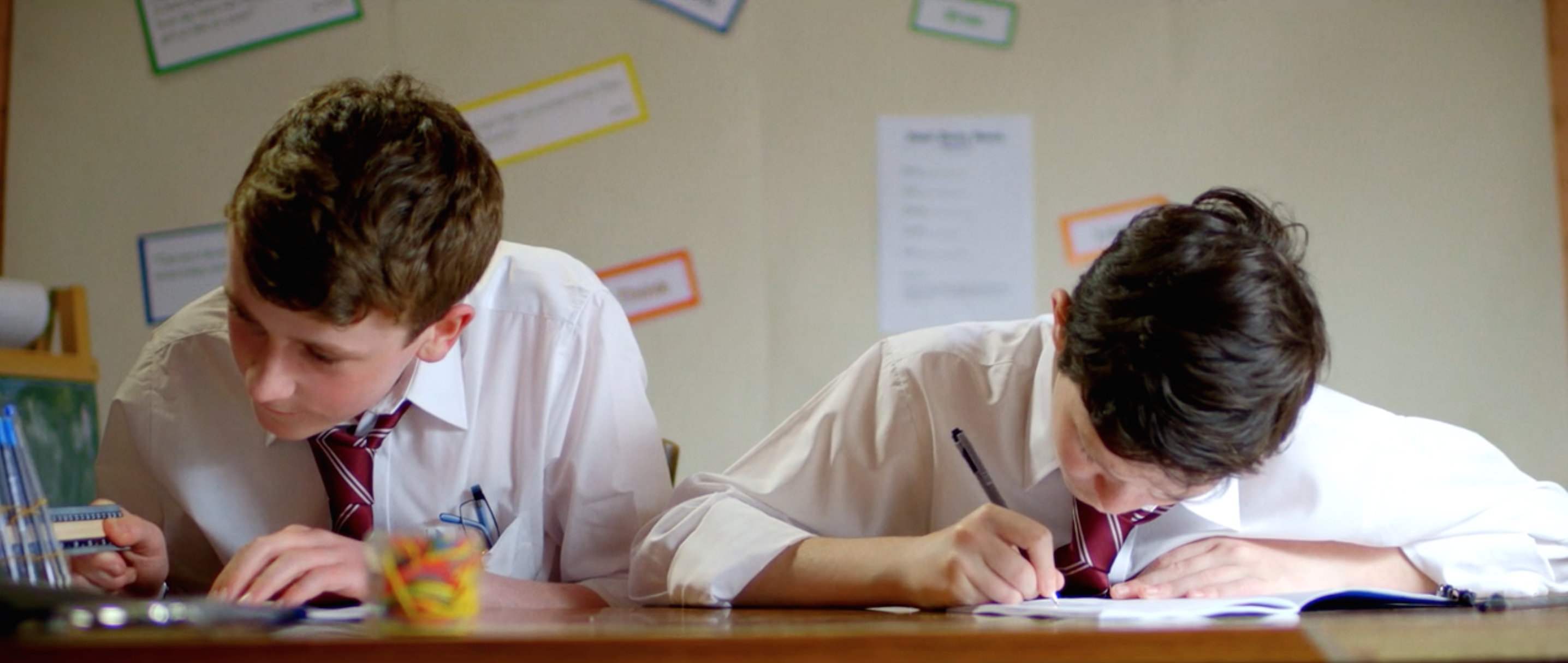
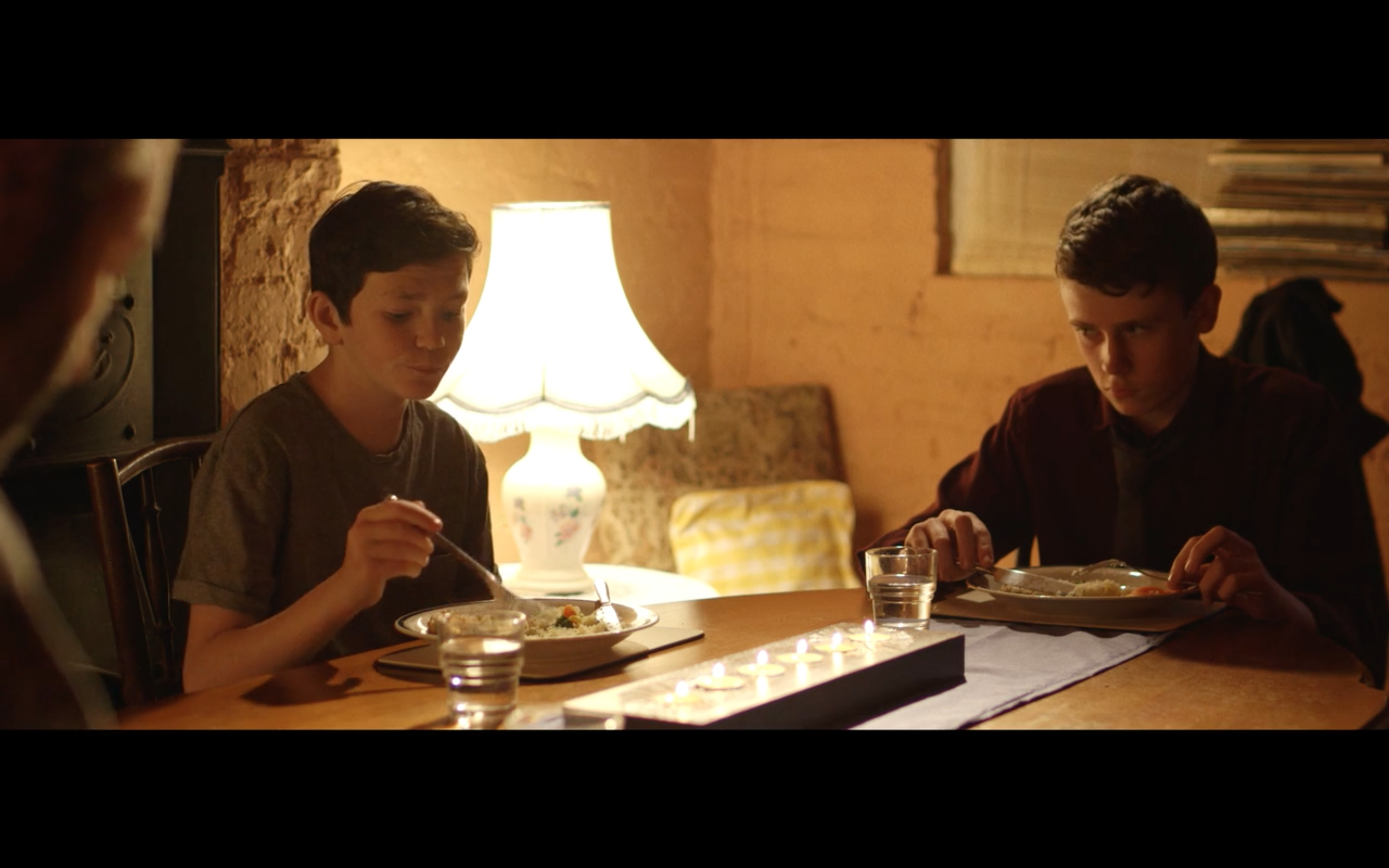
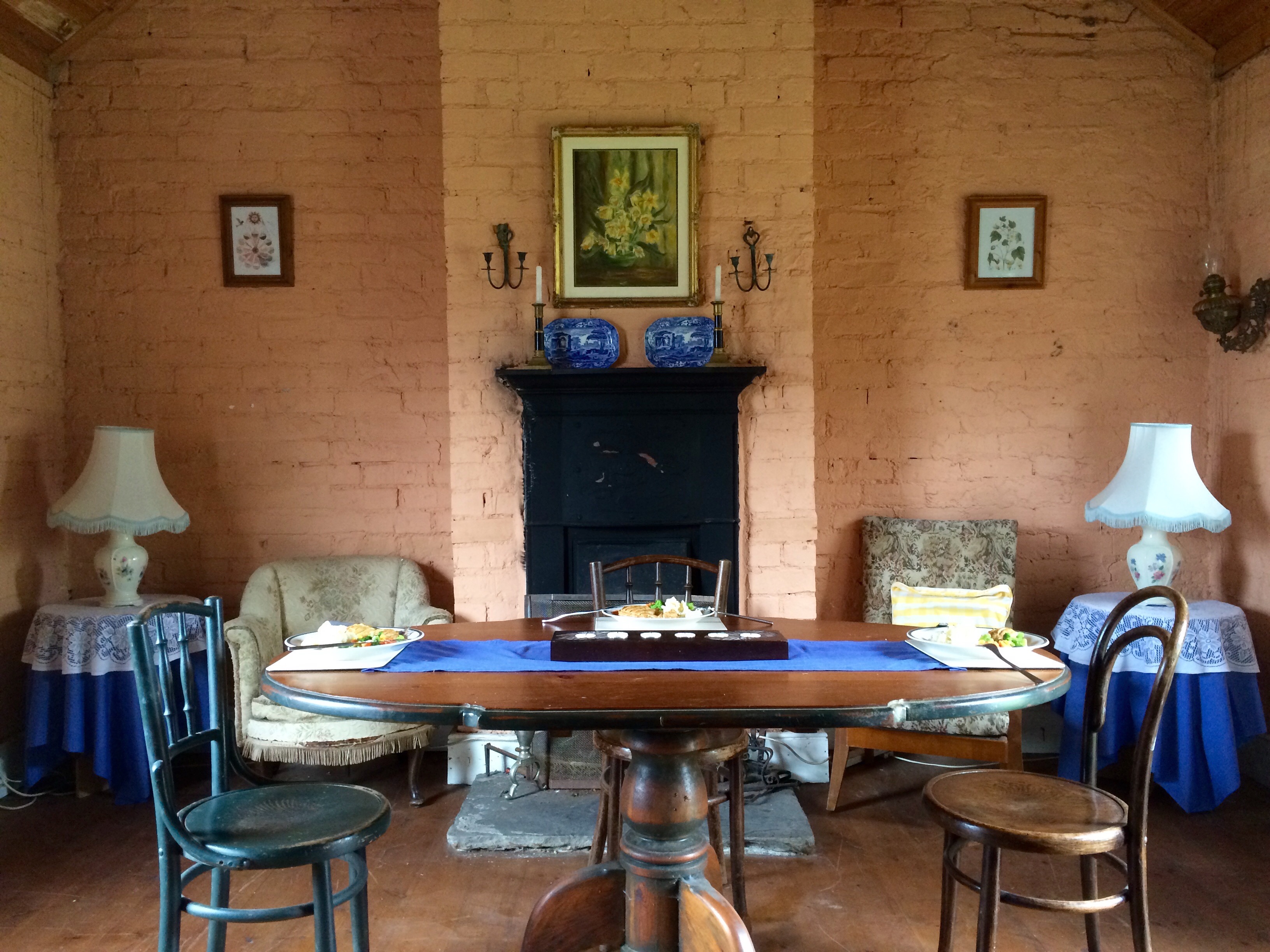
Dining room after dressing, waiting for crew and lighting to complete the set. There was a strong emphasis put on symmetry for this scene.
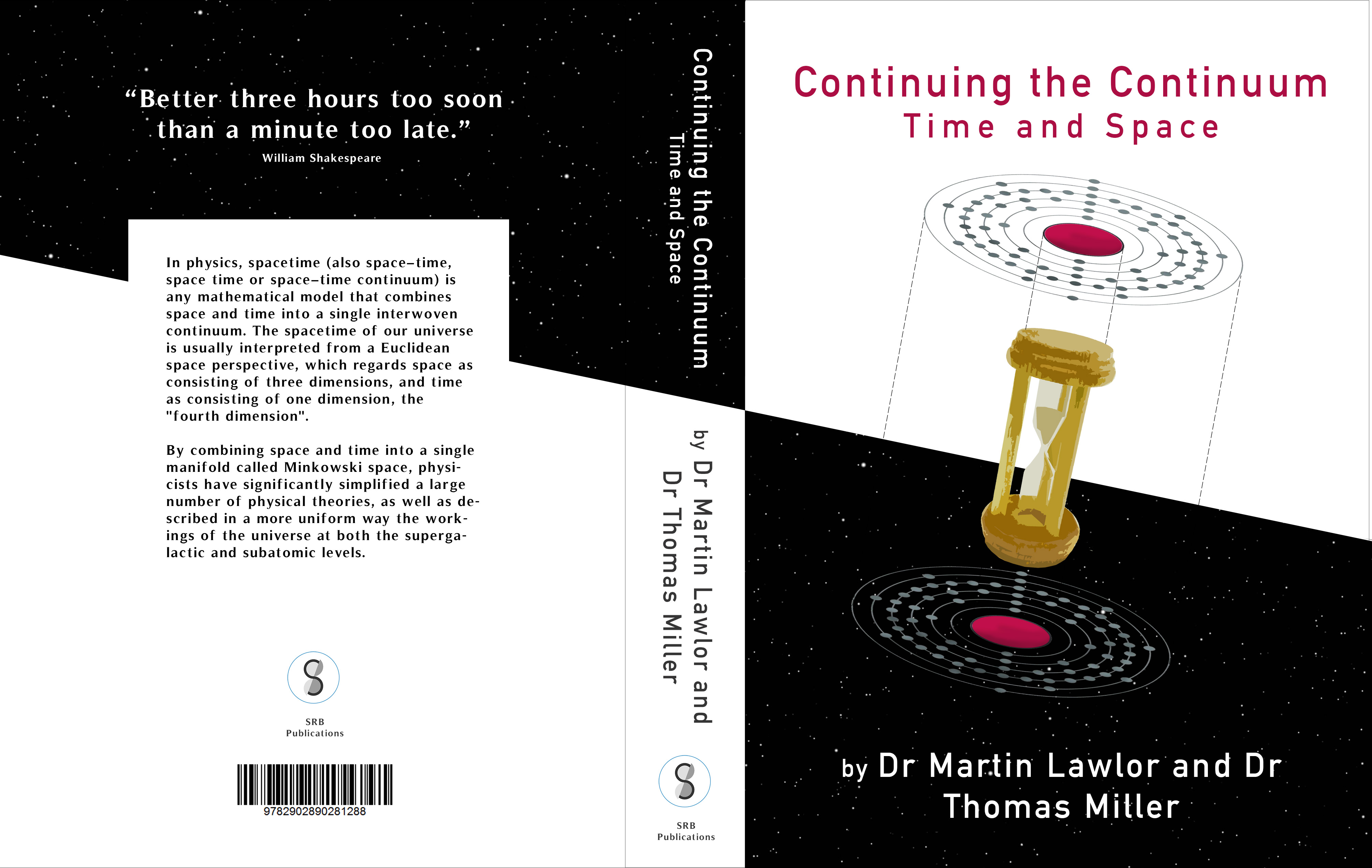
Custom graphic made to cover Lucian’s physics book. The author’s names and tag lines were specified by Aidan Largey as they held a specific meaning to him.
