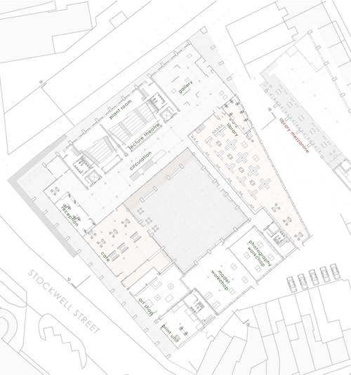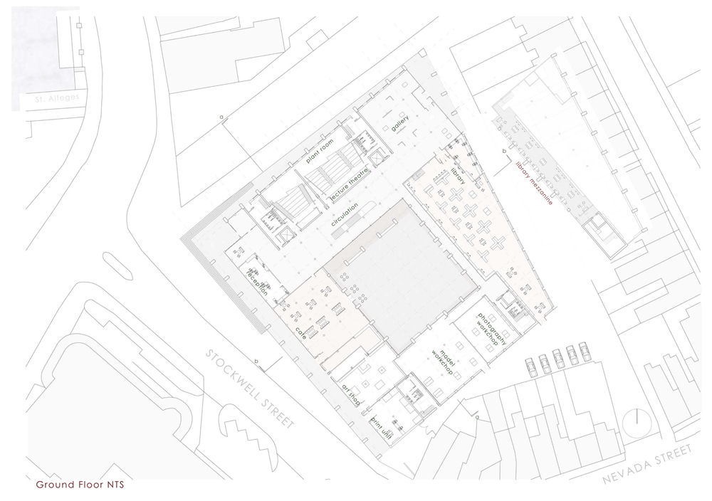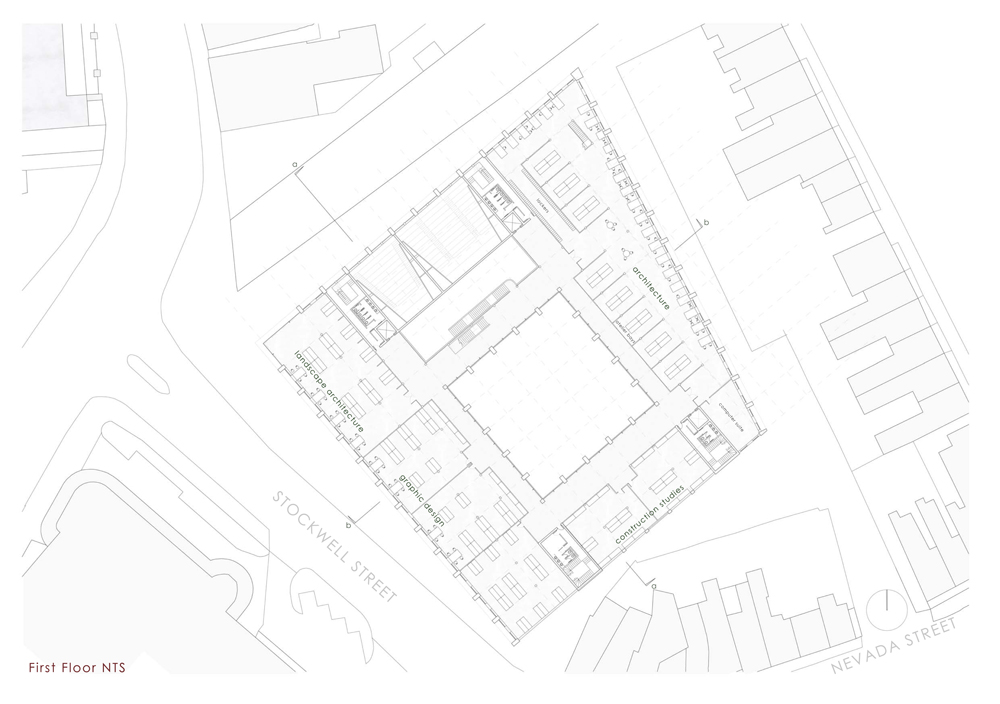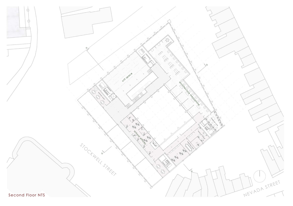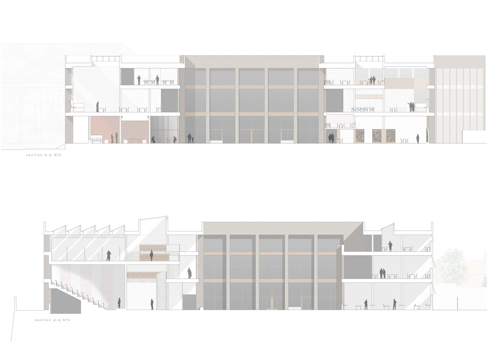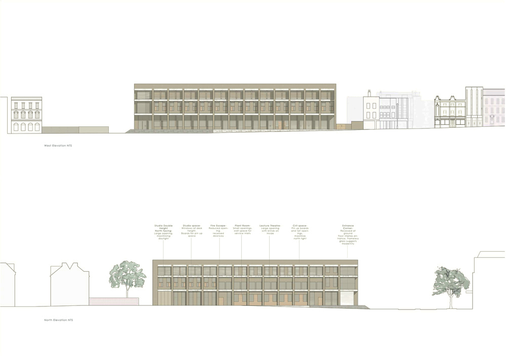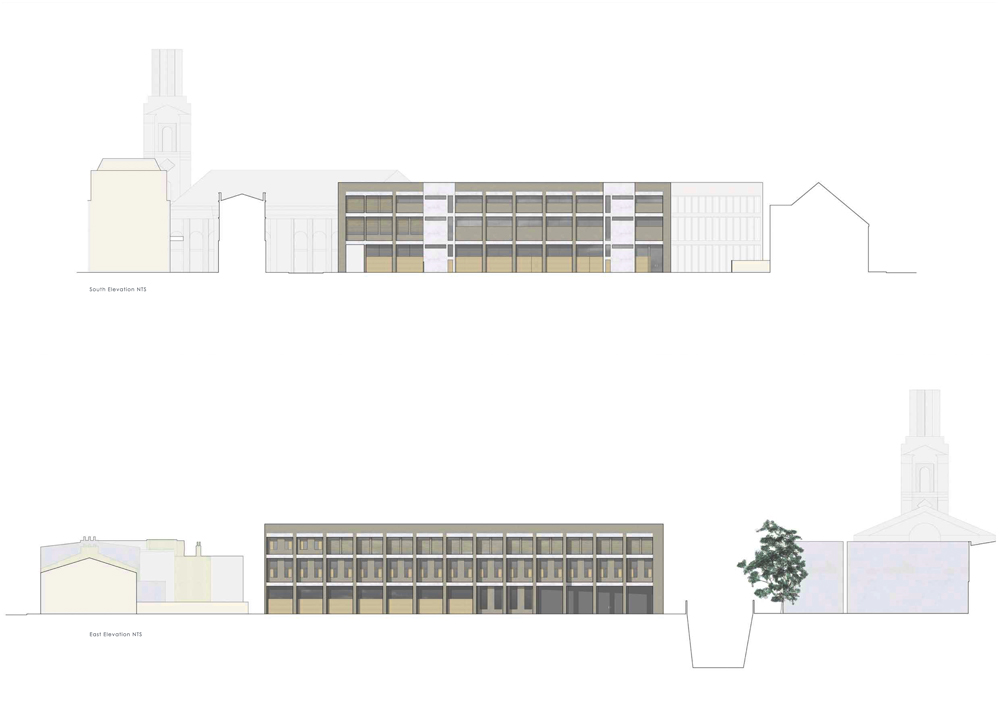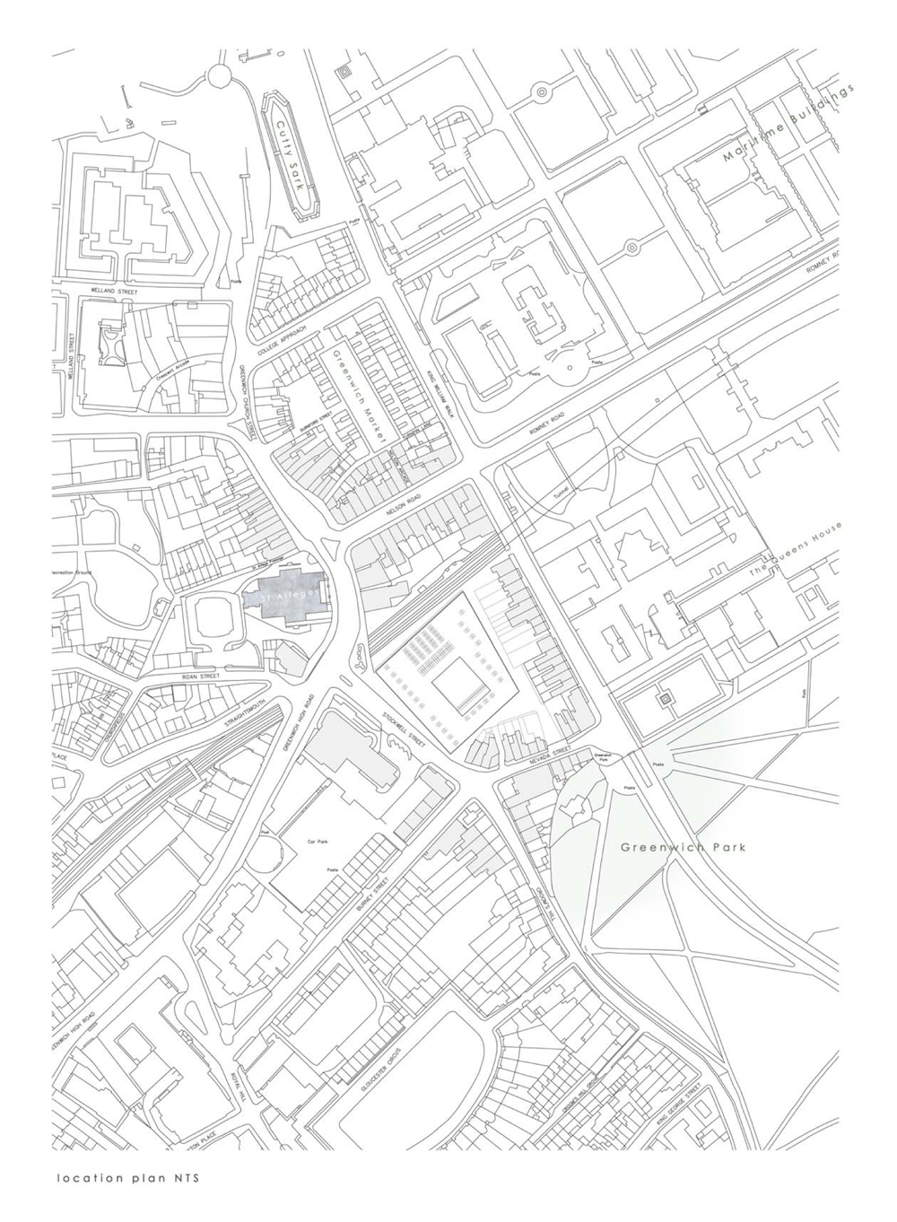
The design changed hugely over a relatively small period of time; but the primary concept of the inside’s relationship to the outside is still evident in the final drawings. It is particularly noticeable in the elevations and the details which have been shown in other posts.
The building is organised around its courtyard (a common feature of architecture in the area). It is split into public and private functions. Public activities are kept the to the street front, ground floor and the functions become more private towards the back of the site and as you move up the building. The circulation shifts subtly as you move to higher floors, to create a dynamic vertical relationship through the building by creating small glimpses into different floors.
The critique spaces overlook the main circulation area and lecture theatres to promote integration and interest between the different faculties of the school (the brief called for graphic design, construction studies and interior design studios for the school as well as architecture.) The architecture studios allow for subtle divisions in an otherwise open planned layout to accommodate the atelier style tutoring typical of Greenwich University’s architecture programme.

