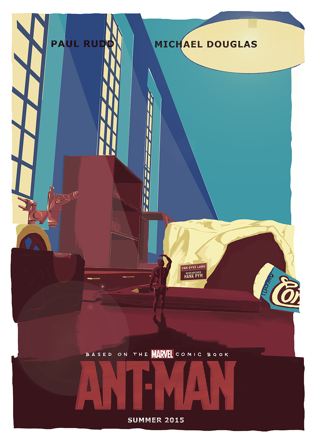
Ant-Man Poster Design
We needed a poster for the background of the Teccles Cake set. I found some great sources for quirky mash-ups of different films or retro style illustrations of new movies. Freddy, my director, asked if we could get a poster for a film that hadn’t been made yet. I loved the idea, giving another knowing nod to anyone in the audience thats observant enough to pick up the peculiar set piece. I decided we could make our own, basing it on a comic or sci-fi film that had been announced and wouldn’t see release until well after Teccles Cake would be published. I was a little disappointed that Interstellar would release so soon, being a Chris Nolan fan.
Instead I remembered about Ant-Man, which had seen a very rocky pre-production phase. Edgar Wright had stepped down as director after spending years trying to get the film off the ground. Edgar Wright, being the king of knowing cinematic pop-culture references, was definitely worthy of our tribute. So I stared piecing together my own film poster. The setting is a laboratory, which I modelled in SketchUp to help get perspective. A white lab coat on the desk chair rests with a name badge that should look familiar to Edgar Wright fans; The coat replaces an iconic white shirt and the name badge reads “Hank Pym” instead of “Shaun”. A Cornetto sits on the desk, referencing Wright’s “Cornetto Trilogy” of British films (the eponymous ice-cream can be found in each of his instalments).
The composition is such that we are on Ant-Man’s tiny level on his laboratory desk, but still looking up at him (he is a hero after all). The lamp in the room channeling a suns presence to further reinforce a shift in scale, with a shadow that spills to draw the eye and suggest transformation. The colour scheme is simple block, primary colours to be eye catching and modern while referencing the comic book origin. I use the franchises released film logo and the most up-to-date casting information I have. It’s all I can do not to add “not an Edgar Wright Film” at the bottom.

