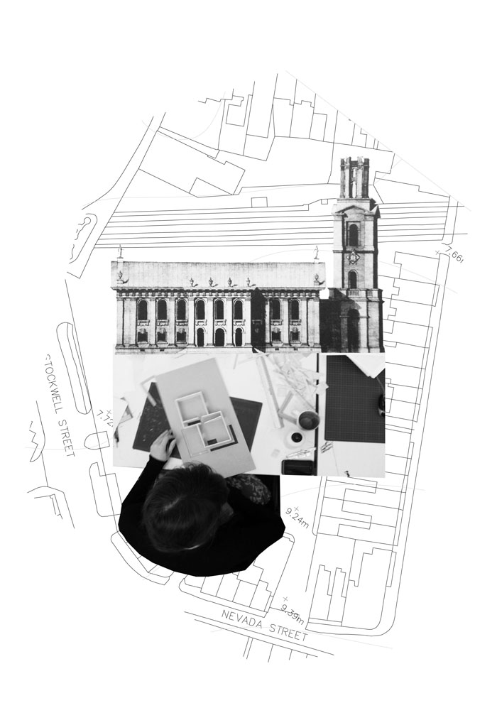
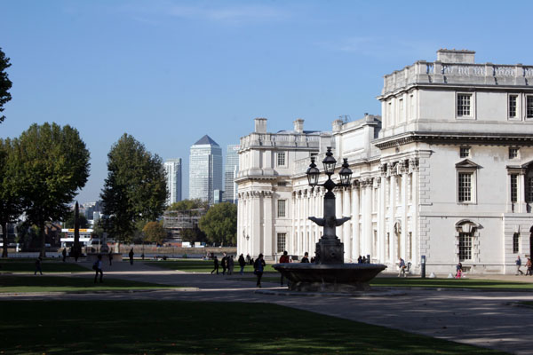
The site for the Greenwich Architecture School project is in a very polite and picturesque part of London. Nearby are classical buildings designed by Wren and Hawksmoor, including the Greenwich Maritime buildings and the Royal observatory from which "Greenwich Meantime" gets its name. So established and genteel are the surroundings that Greenwich Park even held a royal residence, before the Queens House was turned into a museum.
Anyone who has worked in an architecture school or studio for a length of time knows that it is not often a polished or tidy environment. Like most student inhabited creative workspaces the rooms are usually filled with a dynamic mess of people and materials. Any building to be placed in Greenwich would feel a tension on how to relate to its surroundings, but this particular occupation is has an added layer of perversion.
This discord of activities activated an interest in the architects influence on context. Setting a building of this size in a sensitive area would have a profound impact on the experience and atmosphere of Greenwich for years to come. So a balance was needed between function and presentation; and this balance would be hung on the facade of the building where the two meet.
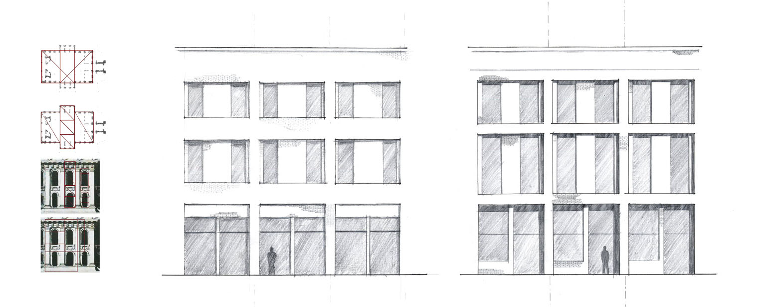
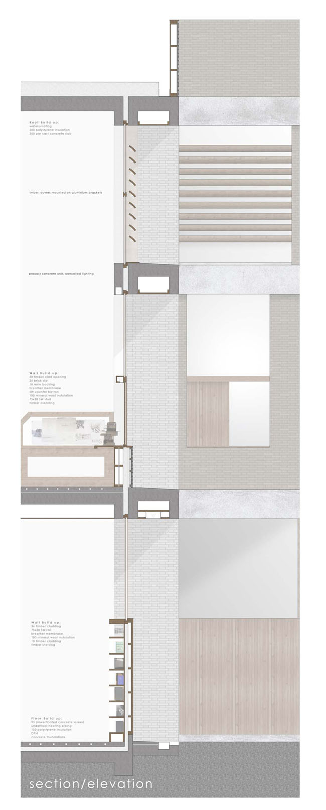
The envelope of the building needed to facilitate the functions of the various studios within whilst relating to the context on the outside. So the facade was designed to be modular. Regular in overall proportions but with changeable elements to satisfy interior conditions. These proportions were dictated by St Alfege's Church, designed by Nicolas Hawksmoor, which faced the site and based on the classical Golden Section.
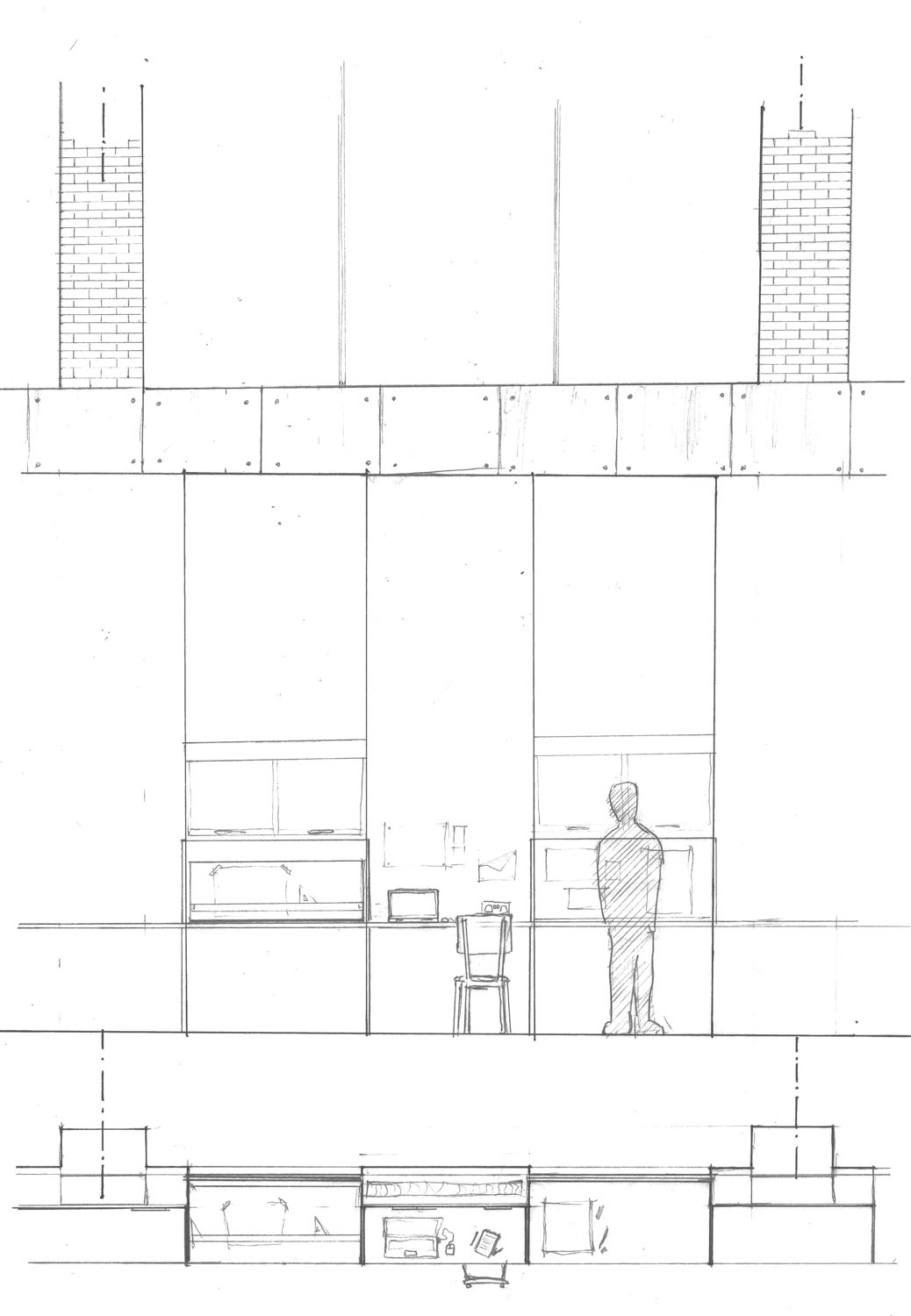
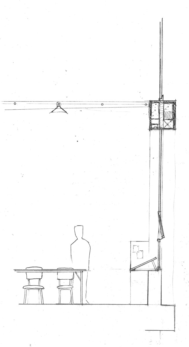
The exterior wall became the focus for the project. Building workspaces into the envelope became another way of expressing the duality of the architecture's function. Detailing the junction well was very important to it's success, each material judged by who saw it, who touched it, it's function for the room and durability. Brick and concrete formed the palette for the building overall, with timber highlighting the workspaces or areas that people made contact with the building.
With flexibility and openness in mind, some elements of the building used cheap materials to make replacing them affordable. The overall construction benefited from a fairly rational grid of columns that allowed for change of use in the future to be a feasible task.

