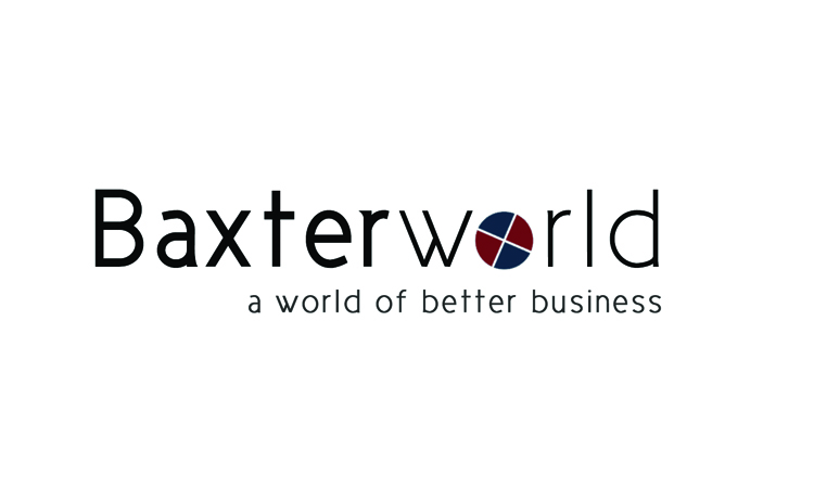
Baxter Associates officially changed its name to Baxterworld last year. This was due to a shift in their services being solely traditional accounting to becoming cloud based, international and including many back-of-house services.
The CEO wanted to pull away from the idea of accountants being "stuffy" and "dull" and wanted their new name and logo to allude to a sleek, modern and international image.
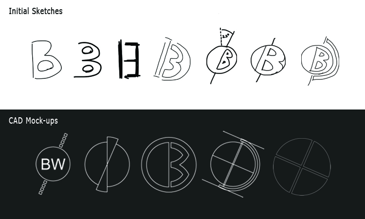
Several sketches were made before homing in on the "world" aspect, using the 23 degree tilt of the Earth's axis as inspiration. After these conceptual stages are through I start drawing on the computer to get an idea of how the design looks with definitive geometries. Eventually a basic symbol is decided upon, from which a motif can be built upon in the web and in stationary later.

